Wednesday, 23 January 2013

Ridiculously Unwearable Fashion


I haven’t written anything on here in a couple of weeks, I think the shock of having to get back in control of homework after the holidays was too much to take!

So I am now back at Uni (sound better then Institute!) in my third and final year, and am just over half way through in my dissertation and it needs to be handed in just over a month. I also have to start wrapping up my main module of fashion and textiles; creating my own collection, drawing illustrations, technical drawings, making a toile and then putting the portfolio together!
Me and my work mates work tables-I'm in the middle!

So I’m going to start by explaining my dissertation. Which now in the third year-the student can pick whatever subject you would like, which started off as exciting to think any subject that you fancied! But it then changed into a “oh my gosh what on earth do I pick?! “             So after considering what it is I’m interested in and also what would fit in with what I will hopefully be doing for my final project, I’m really interested in way-out fashion, Lady Gaga-esk so I have come up with “Ridiculously Unwearable Fashion!”

It sounds good but then I realized there needs to be a lot of research, so for anyone doing a dissertation within the next year or so, start reading things now! I had started reading library books last June, red a few dud ones but they all come in handy one way or another.

Books I can highly recommend were: 

Fashion as Communication by Malcolm Barnard which was very useful when realizing that words that you believe to mean more or less the same thing-don’t. Meanings such as clothing, fashion, style, fashionable, it analyzes what comes under fashion and how fashion is linked to the culture around it.
 

Another book was Fashion-A Philosophy by Lars Svenson which is along the same lines of analysing fashion. He also looks at the changing face of fashion and how it can also be viewed as art. I haven’t read all of it by I can recommend a good read as it looks at the industry in depth.
 

Other books that have helped along the way are:

·         Fashion on the Edge by C. Evans.

·         Extreme Beauty by H. Koda.

·         Radical Fashion by C. Wilcox.

So on this journey of “Dissertation”, I have been googling things, friends have been picking me up items, magazines and papers…etc and I have found a couple of really interesting designers. Whether I put them in my paper, I’m not sure but I defiantly found them inspiring!
Morinaga's designs.

The first is Japanese designer Kunhiko Morinaga who shows at Tokyo Fashion Week. He designs for a brand named Anrealage. Which by the looks of his collections look right up my street! Their different and “unfashionable”, similar to other Japanese designer such as Kawakubo and Yamamoto, he doesn’t think of the conventional body shape which I find really refreshing. I stumbled across him through another blog- thecenterghhs/wordpress and saw some of his designs. His latest collections include wire cages and pixelated garments.
Morinaga's pixelated collection.
 
How cool are these shoes?!
 
This is the first image I saw-it depicts garments that are in geometrical shapes that are being displayed by being hung in an exhibition. I thought this was a really novice idea and one that I have ever seen. They garments are like pieces of art instead of just pieces of clothing.
Morinaga's "shaped garments".
 
This was another image that could my eye-It ignores the western view on enhancing a female body but bloats it up transforming its shape.
 
Another designer I fell across was an Icelandic fashion designer Sruli Recht's who has made his Autumn/Winter 2013 collection from wood. The collection is called Concentrated, it’s a menswear collection and most of the pieces have apparently been made from a single pattern and piece of material. Most the items are quite big and baggy and have quite a muted tone
Recht's Concentrated collection.
 
These images were found on a magazine site DeZeen at: http://www.dezeen.com/2013/01/21/concentrated-by-sruli-recht/
This could be introduced to my dissertation as it runs in very well to my theme of unwearable fashion and also as me myself has an interest in wood; so this was a really fascinating collection to discover.

I love how it does not appear as wood but possibly some kind of glass as all the forms are so neat and sharp.
 
From Recht’s collection I also found Pauline Marcombe who is a French designer who also studied as an architect; therefore being interested in construction. This is just her first prototype and is made from MDF wood and wire.
Marcombe's wooden t-shirt.

I think this is awesome! It is what I really love about fashion; using something from another discipline and creating a new and exciting piece. It does look uncomfortable-but it could be seen as Ridiculously Unwearable! I love the different sizes of triangles that have been adapted to the body creating a very hard and sculptural piece. I love the contrast of the harsh laser cut wood and the soft skin and skirt.
 
Tell me what you think of them too!
 

Tuesday, 25 December 2012

Fashion Ilustrations - inspiration for Portfolio.

Merry Christmas to everyone! Hope everyone is enjoying the season.
Feliz Navidad a todos! Espero que todos esteis pasandolo bien.

Over the Christmas period; as this is my 3rd and final year in my fashion and textiles degree, some of my homework is to think about my portfolio and  to begin organizing how I would lay out the pages. So I have started looking at ilustrations and technical drawings, I've looked on fashion portfolio websites and pages such as Arts Thread, of which I have come across a few images that I like and that catch my eye.
So I thought I'd put a few up here so to keep me inspired and hopefully to inspire others!

Designer Fashion Workshops  I picked this ilustration as I really like the freedom in the lines. The sketch is quite simple but contains everything needed and is pleasing to the eye. It looks like painted


Fashion SketchingFashion Workshops of International Arts Instructor Cynthia Padilla padillapost2@gmail.com.
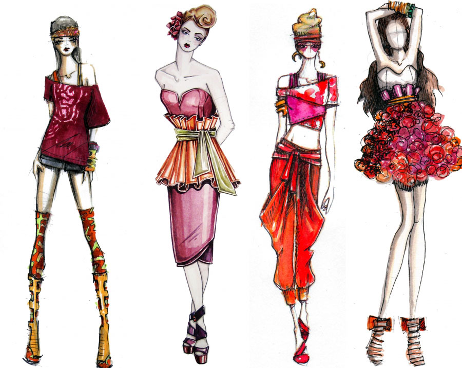
These drawings look more polished-I wonder if they have been assisted by Photoshop or some other computer program. I like the proportion of the figures; with their look thin legs.


Amazon.com: Figure Templates for Fashion Illustration: Over 150
Patrick John Ireland is a member of Britain's Chartered Society of Designers and bestselling author of several books on fashion.
I like the drawings of the figures as well as the garments. I also like the contrast of the grey skin tone against the bright colours of the garments.


Susanna Ngao

Fashion Design Resume — New York, NY.
I love the flow of this drawing. For something so simple I find it really captivating. I aspire to draw like this;  with such fluidity by such a simple line. This looks as if it is drawn with either a hard pencil or koln.
  Drawn by Andres Chavez in ink.
I love the textures achieved with the brush stokes and shading with the different tomes of colours.
Lady Gaga sketch by Hayden WilliamsLady Gaga by Hayden Williams. Hayden Williams
I'm not familiar with Haydon Williams-but I have found some amazing figures. Drawn with just pencil or coloured pencils, but the figures have a good flow from the figure to the dress.


Vera Wang "Holly" Spring  2012Marker and InkAlthough I don't overly like the ilustration and in my opinion it's not drawn perfectly. But I like the angle of the figure with the volume and frills of the fish tail skirt.
Hayden Williams: The Architecture Collection Hayden Williams.
Love the figures and the designs! Monocrome with the black and white. I think these are very me!

Leanne Marshall. I like the water colours used on this drawing. I always thought water colours could be a little messy but this has shown me wrong, also shows how vibrant the colours can be.

Tuesday, 18 December 2012

Hollywood Costume exhibition


Yesterday I was lucky enough to go to London and visit two shows; Hollywood Costume exhibition in the Victorian and Albert Museum and the Valentino exhibition in Somerset House.
Firstly I went to the V&A to see the Hollywood Costume exhibition and I have to say it was amazing! I didn’t expect them to have such a large amount of costumes-they filled 3 separate rooms! And there were costumes from all types of films and eras, I loved it!
They were spread out in the middle of the rooms where the public could literally go right up to them, they were not behind any glass so you could see them properly and they were so close you could have touched them. Of course you can’t do that! You couldn’t take pictures or even sketch which I found a bit harsh but where there’s a will there’s a way!
 
Royal section of exhibition.


As I was walking around the “Royal” section where they had costumes from Shakespeare in Love and Elizabeth, I couldn’t help myself but try to take a few sneaky pics! I love period films and I am obsessed with Tudor fashion (doing my final project in Spain based on Elizabeth I) so this was the perfect opportunity to see them up close. And they didn’t disappoint-the fabric and the beading on them were astounding. The headpieces and ruffles looked so pristine and beautifully made; I remember looking at one gown that has pearls that where sewn all the way around the hem of the outer skirt-It was beautiful.


Another costume I loved was Cruela DeVil from the Disney film of 101 Dalmatians. They has two costumes there which demonstrated the two sides of Cruela; one where she had become nice and loved animals and other when she returns to her usual evil self. I loved looking at them both and noticing the difference between them even though they were very similar. The bad version had a longer skirt, the pointy shoes were shinier and even though the print was virtually the same print although the bad version had a metallic thread through it so it gave it another edge.

 
Cruela DeVil.
 
Other costumes I loved were Audrey Hepburn out of My Fair Lady, Kate Winslet from Titanic and Vivienne Leigh from West Side Story.
                       West side Story                                              Katherine and Audrey Hepburn

But it wasn’t until the end that I thought I was going to explode! Right at the end of the last room, the last two costumes were Judy Garlands dress from The Wizard of Oz and Marilyn Monroe in the Seven Year Itch!!(The white one!) They were amazing to see and analyse while standing there. Even the Dorothy’s red shoes were there and were beautiful. I especially took a while analysing Marilyn’s dress-her waist and under bust were tiny! And then comparing them to her boobs they looked so big for her size! The dress hung beautifully and it was lovely to be able to see such iconic costumes.
Judy Garland's dress from the Wizard of Oz.

The shoes!

Marilyn Monroe dress from Seven Year Itch.

There was so much more of the exhibition; there was a Robert Deniro area, they had costumes from Cleopatra, Gladiator, Indiana Jones, The Addams family, Dracula, Die Hard, Rocky, Spiderman and Cat woman as well as loads of others. I would defiantly advise anyone who is interested in costumes or even just an enthusiastic film fan to go and visit the exhibition. I loved the really old costumes such as Audrey and Marilyn but I would be confident in taking my fiancĂ© there as well as there was loads of newer and action films. I’m defiantly going to try and get back there again and try to take my Mum as I’m sure she would enjoy it as well!
 

Some of the other costumes in the exhibition.

Tuesday, 4 December 2012

London College of Art Exhibition celebrating 175 years.


This week I had a trip out to London.  During my trip, I went to the London College of Art to visit their exhibition that is celebrating 175 years of the school. It showcased some of their previous students work such as Christopher Bailey and Henry Moore. If I’m honest I didn’t know what to expect; the exhibition was quite big and consisted of different kinds of art, sculpture and a bit of fashion. I had a little mooch around and found some items and pieces really interesting-I didn’t know very many artists there but there were plenty of different pieces to keep you intrigued. The exhibition is free to enter and it was prohibited to take pictures-though I did take a few!

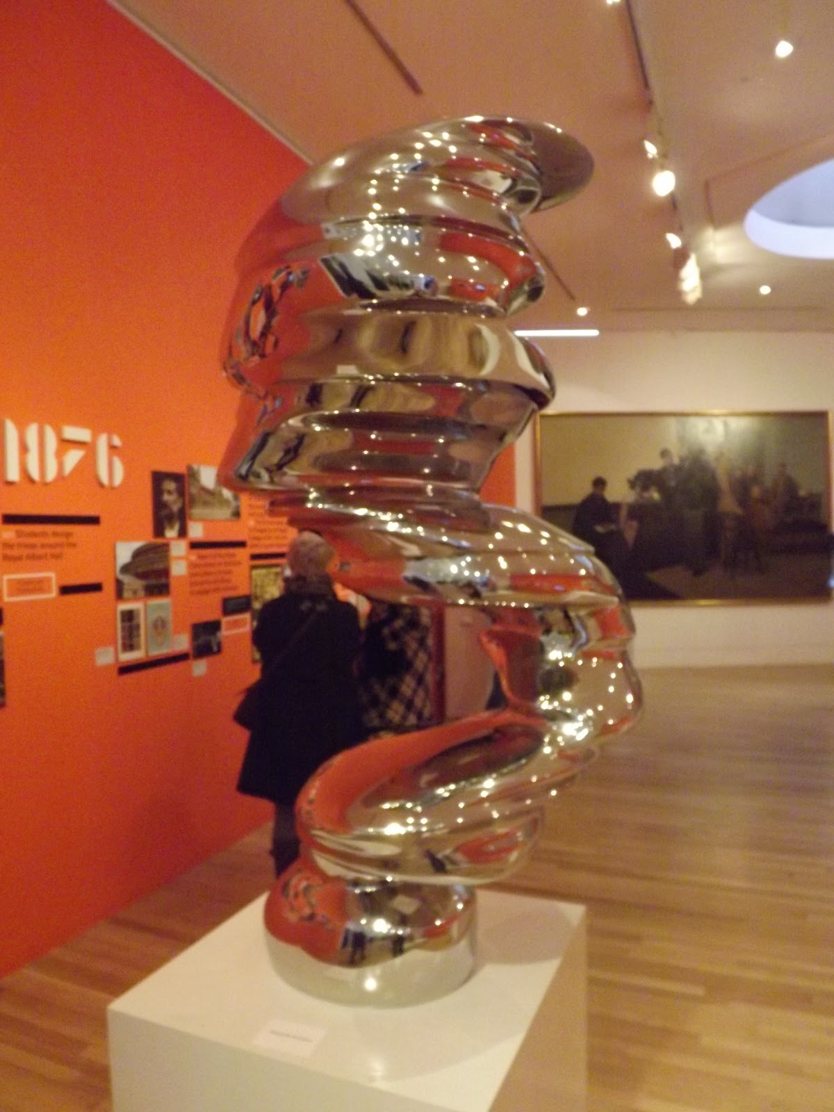
 I found this sculpture quite intreeging. I don’t know its significance but I enjoyed looking at it. The smoothness of the circular forms and being made in a stainless steels gives it an appealing visual look.  
Line of Thought by Tony Cragg 2002

I loved this sculpture, I found it really eye catching and different. I don’t know what the meaning is but I understood it as a protective significance as the tiger was growling and shoots out spikes of protection.

Spike by David Mach 2012

A couple of painting I did like was these ones;

I didn’t realize until after, but they are painted by the musician Ian Dury. I thought they were very different to what else was in the gallery. I found them quite feministic to begin with but now I am wondering if there was another meaning behind them.
(And I did Google Jemima Proust and from what I can gather she isn’t a real person!)

Wednesday, 14 November 2012

Shingo Sato live at the Colchester Institute-Box intergration.


Yesterday was such an amazing day!

The designer Shingo Sato has been visiting the UK and as well as visiting Central St Martin’s and London College of Fashion during his visit, he kindly popped in to the Colchester Institute!

Shingo Sato is a Japanese designer who is known for his Transformational Reconstruction technique which is a different method to cutting patterns flat from patterns and concentrates creating more in 3D. As he is possibly the only person that uses and teaches this technique; it was a fantastic opportunity!
 
Shingo Sato
 
When he arrived and gave a little speech and presentation about his work and explained what he does, showing samples of his work to the group. It was exiting listening to him and hearing him quizzing students about how to create these designs. We were then lucky enough to take part in a workshop with him where he decided to show how to make Box integration.

Box Integration technique.
 
 This included making a bodice block up to then work upon, creating a box design on the front that touched the apex’s of both front darts. The box is measured and then out of card and stuck onto the bodice with tape. Then drawing the style line across the bodice and box, create the new seams which once sewn will create the new design. After cutting all the pieces out and transferring them onto fabric all that’s left is to sew it all back up.


Finished bodices from the class.
 

As another class mate Sam Purnell and I had previously done this technique, Shingo gave us our own “1 on 2” lesson and taught us the box integration on the shoulder. This was really exiting although I did feel the pressure! This was a similar technique but moving the box onto the shoulder.
Shingo giving a personal lesson on box integration on the shoulder.
My bodice.
Photo taken by Shingo-concentrating!
All the pattern pieces cut out onto fabric.

I’m not sure if it was because I was feeling under pressure as he was there watching but I found the technique a little difficult. It was all ok and I felt really confident- then I got to the “sewing it all back together” part and miraculously lost two of my four points on my square! Gradually, it was sorted out and I managed to finish it feeling really proud of myself!
My finished bow integration.


From the top-showing the shoulder square.
 
It is made with a soft brown cord and a cotton fabric; which had a facing ironed onto it to help keep the form of the square upon the shoulder. I’m very happy with it as a first attempt and am quite inspired by this.
I’m now considering thinking what else I could use this technique for and to create my own way out designs!
Check out You Tube to find Shingo Sato videos on Transformational Reconstruction.